# Import Libraries
import pandas as pd
import matplotlib
# Magic Code for Inline Display
# in Jupyter Notebook (if you're using that)
%matplotlib inline
# Create Dataframe from tables at URL for Iowa COVID-19 Testing
url = 'https://covidtracking.com/data/state/iowa/#history'
df = pd.read_html(url)
# There are multiple tables on the page,
# and they are saved in a list.
# Choose the 2nd table and rename to 'df'
df = df[1]
# Set the type for the column 'Date' as a datetime type.
df['Date'] = pd.to_datetime(df['Date'])
# Set the newly typed "Date" column as the index.
df.index = df['Date']
# Create a new dataframe from the original with only
# the 'Pending','Negative', and 'Positive' columns
iowa_testing = df[['Pending','Negative','Positive']]
# Plot this new dataframe as a stacked bar graph
# Invert the axis so time moves forward.
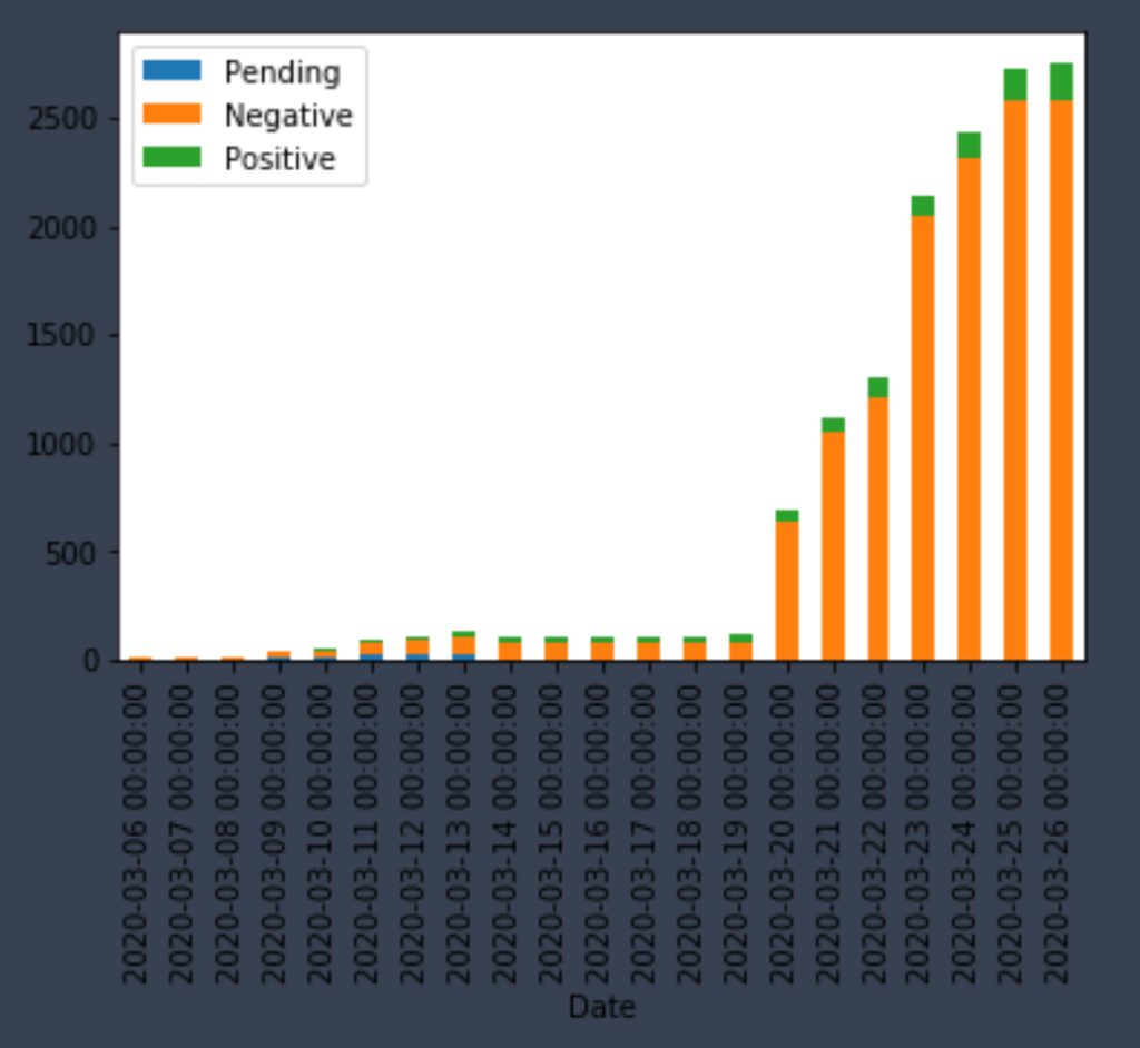
iowa_testing.plot.bar(stacked=True).invert_xaxis()It outputs something that looks like this.