
The Poster Elements
This poster is comprised of the following primary elements:
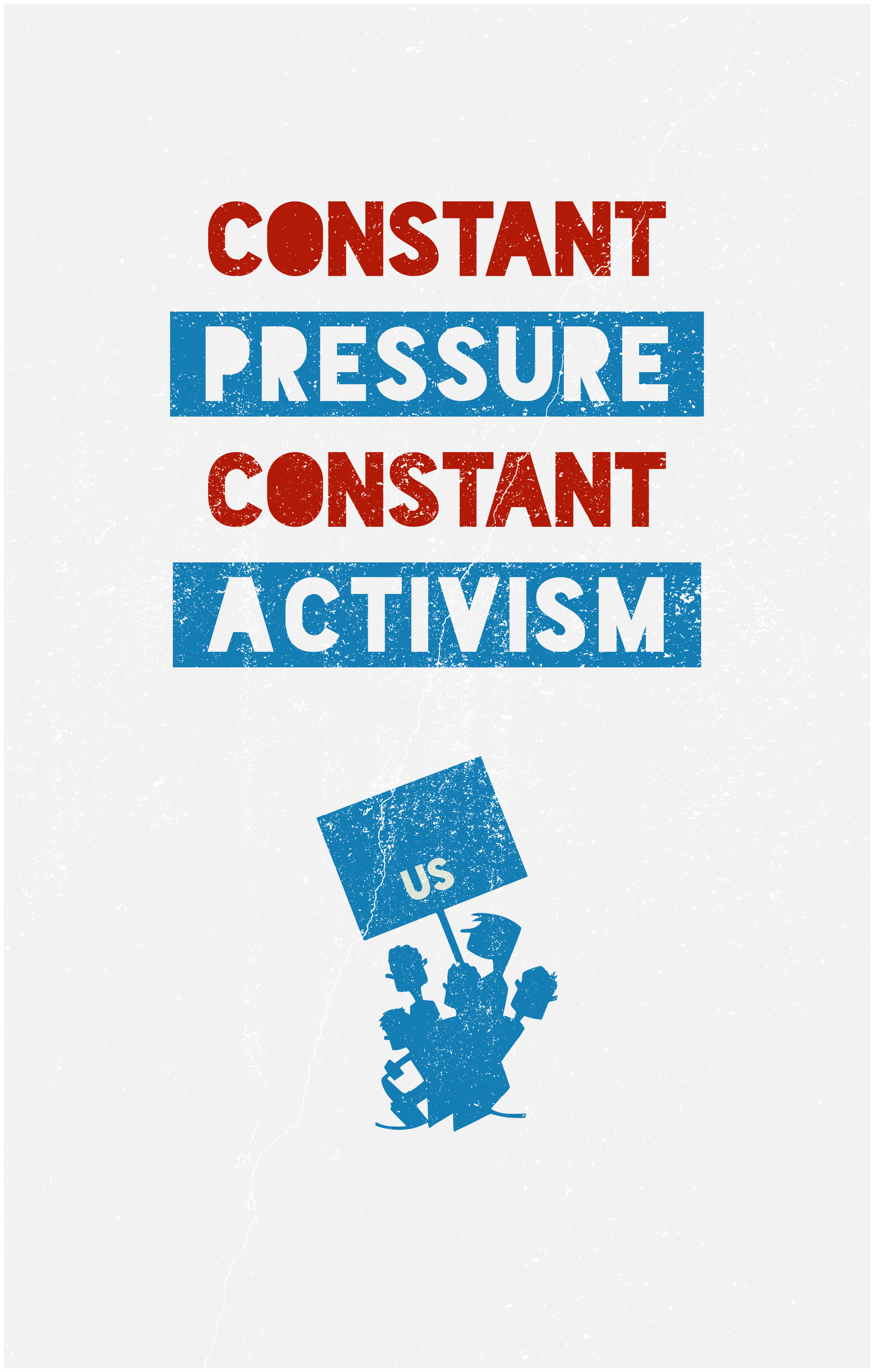
- Partial phrase: “constant pressure, constant activism” uttered by Noam Chomsky in a recent interview.
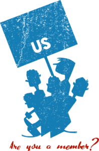
- Two Works Progress Administration (WPA) posters:
- Graphic & Question: Be kind to books club Are you a member?
- Colors: Exhibition [of] watercolors
- Font: Blackout by The League of Movable Type
- Grit: Manipulated grittiness (me) from a photo by Yeon Li on Unsplash.
The Creation of Fire
The WPA has long been a source of inspiration, awe, and and envy for me. With an extensive background in the arts and theater, the very concept of the government directly investing in the arts in a profound way that leaves a deep impact not only at the time but nearly a century later is something akin to the creation of fire―and the arts was only a part of that wonderful project.
The recent centrality of the Green New Deal―with it’s framing firmly and clearly recalling the New Deal, from which the WPA emerged―has allowed that previous envy to turn to a weird nostalgic hope that my own lifetime might have such a force of art unleashed on the nation.
And if you haven’t read the Green New Deal take the below, easily accessible links, as me encouraging you to read it. I highly recommend the attractively formatted 14-page PDF version, but here are both: [html] [pdf]
So entwined is this national history of art (even the stylistic components) that as the Green New Deal has continued to grasp the imagination of climate activists it was even promoted by commissioned artwork recalling that distant past.
The Spark
I’ve long been musing and meandering internally about somehow contributing artistically to this Green New Deal reality that I would like to exist. Sanders’ movement was and is a part of that reality and seemed the most obvious conduit through which to achieve it.
It still is.
Noam Chomsky’s musing on the Sanders campaign―notably distinct from the movement―was instructive for me:
It’s common to say now that the Sanders campaign failed. I think that’s a mistake. I think it was an extraordinary success, completely shifted the arena of debate and discussion. Issues that were unthinkable a couple years ago are now right in the middle of attention.
The worst crime he committed, in the eyes of the establishment, is not the policy he’s proposing; it’s the fact that he was able to inspire popular movements, which had already been developing — Occupy, Black Lives Matter, many others — and turn them into an activist movement, which doesn’t just show up every couple years to push a leader and then go home, but applies constant pressure, constant activism and so on. That could affect a Biden administration.
– Noam Chomsky on Democracy Now
US
So in addition to the nice quote and concept of “constant pressure, constant activism,” this comment helped me to contemplate what Sanders’ Not me. Us. movement might look like without the Not me part―just Us, graphically.

Yes, it is extremely basic, and no, I can’t say I thought about everything fully here from a design and/or marketing perspective as I was just making a poster with a nice quote, but the simplicity of US being on the bottom center of an otherwise empty sign for many reasons felt right.
- Underdog: Us isn’t on the top… yet.
- True Center: Us isn’t even really on the left―Us is center.
- Young/Small: Us isn’t big enough… yet.
- Acronym: Us is also the U.S.
- Sans Sanders: Us doesn’t have a Me that it’s not anymore―it’s just Us.
On the last bullet point: I did briefly contemplate having a Not me on top of the Us, but it’s not needed and it’s not the point. There’s a beautiful simplicity and solidarity in the lone US on a sign, especially when it’s held by characters drawn between 1936 and 1940 as part of the WPA, which was part of the original New Deal, originally to promote books (and presumably the scary socialist libraries that house them). You can see artist Arlington Gregg’s other WPA poster work at the Library of Congress.
Let me know what you think of this thing. And, as the Sanders yard sign was recently stolen from my font yard I’m thinking of replacing it with an “US” yard sign. It might look nice for a minute before it disappears, but it’s meaning would live on.